
Git Coupling Pie Chart is one of the interactive graphs Understand can draw of your code — call trees, dependencies, control flow, and more.
Git Coupling Pie Chart
Languages: AnyTargets: Files
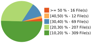
Shows a pie chart of git coupling.
This chart shows the number of files with coupling percentages within a given range.
A file is coupled to another file through Git if they are both modified in the same commit. The coupling is measured by the number of commits the two files co-occur in divided by the number of commits for the target file. Files that frequently change together, especially without dependencies, can indicate design flaws.
To reduce the noise in the metrics, two thresholds are imposed. A pair of files is coupled only if the number of shared commits is greater than 5 and is greater than 10% of the total commits of the target file.
See also the Git Solution, the blog article ↗ describing the Git plugins, the interactive report Git Coupling, and the metrics Git Average Coupling, Git Max Coupling, Git Coupled Files and Git Strongly Coupled Files. Also related is the architecture metric Git Cohesion .
This variant is a plugin. It can be enabled/disabled from the Plugin Manager.